Jennifer Dove’s Copic Corner – Blending
This mini tutorial it is all about blending. There are many ways to blend, and different instructors teach different methods. I am going to share with you the method I recommend.
Before we even start with blending though, we will want to talk about how we choose our colors. There is a number associated with each Copic marker. The number is located on the side and/or end of your marker, and it is referred to as the color code. I recommend you find a color that you like and purchase a couple of pens that are a couple numbers lighter or darker within the same number family. It is always easier to get color recommendations from others that work well, but we don’t always have that luxury. I am going to give you a list of markers I think work well together just to get you started.
Purple: V12 V15 V17
Pink: R81 R83 R85
Red: R35 R46 R59
Yellow/Orange: Y15 Y38 YR68
Brown: E31 E35 E57 E79
Skin: E50 E51 E93
Green: YG25 YG63 YG67
Olive: YG95 G99
Blue: B91 B93 B95 B97 B99
Sky: B00 B000 BG0000
Gray: C1 C3 C5 C7
Blender Pen (0) Note – NOT used to blend colors together
These colors will get you going with the basics color choices, so let’s get blending!
Basic Blending
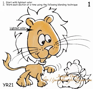
Let me start out by saying it takes more ink to blend dark colors light than it does to make light colors dark. Confused already? Okay, let me start again with more detail. When coloring, you will want to pre-moisten the part of the image you wish to color with your lightest shade. This prepares the cardstock for the darker color and allows the darker color to “float” on the surface instead of soaking into the cardstock becoming harder to blend out. Do not attempt to color the whole image at once, just sections, as we want to work the ink while it is wet for best results.
1. Start with your lightest Color
2. Work each section at a time.
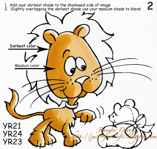
3. Add your darkest shade to the shadowed areas of the image
4. Slightly overlap the darkest shades using your medium shade to blend. (I prefer to use a wide flicking motion.
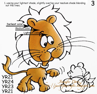
5. Using your lightest shade marker, slightly overlap your medium shade to blend out the previous colors lines.
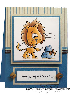
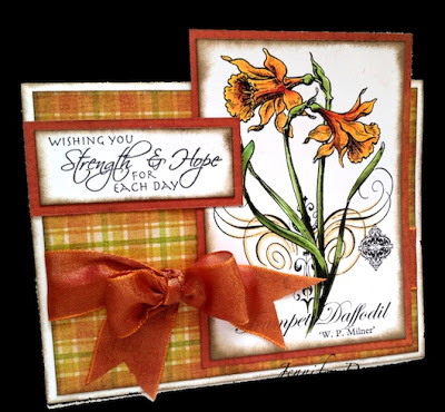
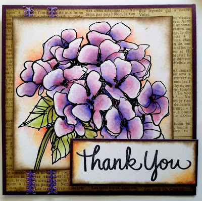
Results below
There are a few other techniques to use for blending; however, I do not recommend them for large areas.
Tip–To-Tip Blending
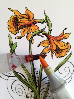
Touch the tip of a lighter colored marker to the tip of a darker marker, and then apply the ink from the lighter marker to your image. Repeat this step as needed.
Note: Always wipe off remaining darker color of tip of lighter marker before putting the marker away to help avoid tip staining
Why would we use tip-to-tip blending? I use this technique when I am working in a small area and do not have enough space to blend numerous colors together. Like in the photo below you can see I used a red and a yellow and got orange out of the two colors. Maybe you don’t have very many colors yet and want an orange. Use the red and the yellow and get this result. I do not use this process as often, especially in larger areas since it can be difficult to get an even blend.
Palette Blending
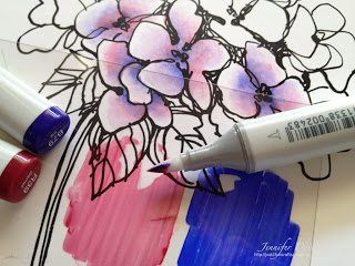
Applying ink to a piece of Acetate or smooth non-porous surface as your palette. Use a lighter marker or blender pen (0) to pick up the ink off the Acetate surface and apply it to your image. Note – Blender pens will lighten the color of the ink.
I like to use this technique if I want a more transparent look, similar to watercolor. I also use this on things such as fairy wings, snow, or something that might be translucent.
Like with any medium, blending takes a little practice. Do not get discouraged. You will find that it will become second nature after a while, and the results of coloring with your Copic markers are very breathtaking with the vividness of the colors. If you would like to try your hand with any of these images they can be purchased from your local retailer. All images are compliments of Stampendous!
I hope you enjoyed!

Wonderful tutorial! Very informative and clearly written! Thanks!
So beautiful, Jenn! Love the projects, they're so gorgeous!
Wow! this was a fantastic tutorial! Thanks for the great tips!
Great tutorial a good refresher from your in person classes!