Jennifer Dove’s Copic Corner – Monochromatic
http://just4funcrafts.blogspot.com
Welcome back to the Copic Corner.
I thought we would talk a little about coloring monochromatically. Some of us are just getting started and only have a limited amount of pens to start off with, so this technique will be perfect for you.
The monochromatic color scheme uses variations in lightness and saturation of a single color. Another way to say it is, “Colors that are a shade or tint lighter or darker in the same color family.” It leaves you with a clean and elegant colored image without having to use a lot of pens. Different monochromatic color choices allow for a different feeling or moods to be portrayed. Monochromatic coloring is easy to manage, and always looks balanced and visually appealing. You want to make sure to have nice contrast within the color family, and I encourage you to leave white as your lightest highlight especially when coloring faces.
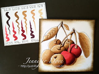
How To: First choose an image that speaks to you. Next start by getting a scratch piece of paper and choosing your main color. You then want to grab a handful of pens within the same color family in different shades of that color. Test them out on the scratch piece of paper to visually see your color choices and make sure they will blend together.
Start coloring using the general blending method.
Another little Monochromatic twist you can do is called mono-chromatic spotlight coloring. To accomplish this method you will color the whole image monochromatic except the parts you wish to stand out as the focus. It will give your image a little more “pop”. Notice the cherry image with the color pop? A small amount of color makes a huge impact.
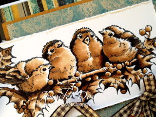
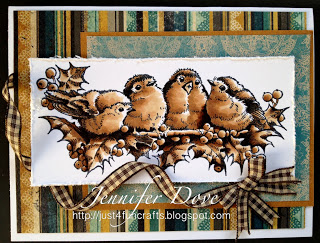
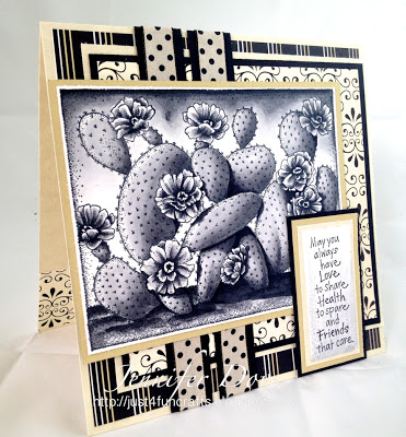
Here are a few samples of images I colored using the monochromatic technique.
image by PSX – Discontinued
Image by Peddlers Pack


Just fabulous Jennifer! I wish I could find the details like you do!
Hugs,
Julie
I love your coloring! Thanks for the tutorials. Do you want to come to Ohio??????