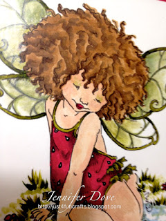
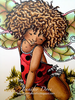
A few years ago when I started coloring I was just “feeling” my way around using my pens. With no exact instructions on how to use my pens, what paper worked best…and ink pad choice. When I first started I was using STAZON (highly NOT recommended). I was just days away from giving up because everything turned out like monkey poo. Since then, with lots of experimenting, researching and coloring I have finally felt like I have “got a grip” on using my Copic Markers. Here is something I colored a year ago. I loved it a year ago but wanted to see how I have progressed. Here is a comparison to show you.
The image is by Mo Manning (Digital Pencil Too)
2010 – I am quite pleased with her hair. (E31 E35 E57). All I did was little squiggles with dark, medium, and light after coloring all over with the lightest. I even like the outfit (r35 R46 r59). Her wings were with YG95 but were not smooth so I added some pearl paint over them. Here skin (God only knows what colors I used). The skin is blotchy and I am not happy with the outcome but back then it worked for me. So this was one of my favorite images colored “way back when”.
2012 – And this is now. I chose colors that posed more of a challenge for the skin (E25 E27 E29) and was able to accomplish smoothness. I even added shadows using BV04. Here outfit was with the same colors as before (R35 R46 R59) The wings were with R35 YG11 BG10 and YG95 using tip to tip application. Here hair…same squiggle idea but this time I went with E79 as my darkest with less blending for more contrast. (I like both coloring styles). The water was also using tip to tip with the BG10 YG11 and E25, tip to pallet. I am more pleased with the overall of this rendition of the image, but even more pleased to see I have grown.
Don’t give up! Keep on practicing, playing and creating. You don’t improve by just staring at your paper with pen in hand…you improve with applying it to the paper…over and over and over again. It is just paper and ink!


Both are beautiful, but I can definitely see the differences…really cool to compare them and see why something works better than a different thing. Thanks for the motivational speech too…we can all use that from time to time LOL! Best, Christina.
Wow! What progress you have made. The first image is nice, but the second image looks like a complete work of art! Very inspiring.
Wow–I found your site from Pinterest. I love your comparison photos.Both are really great, but that lovely chocolate skin is so beautiful! I'm still in the phase of the first photo, but hopefully with more practice (and helpful blogs like yours), I'll get there! Thanksfor sharing!
Wow, I thought the first one looked great and read on to the second, amazing! Thanks for the inspiration!